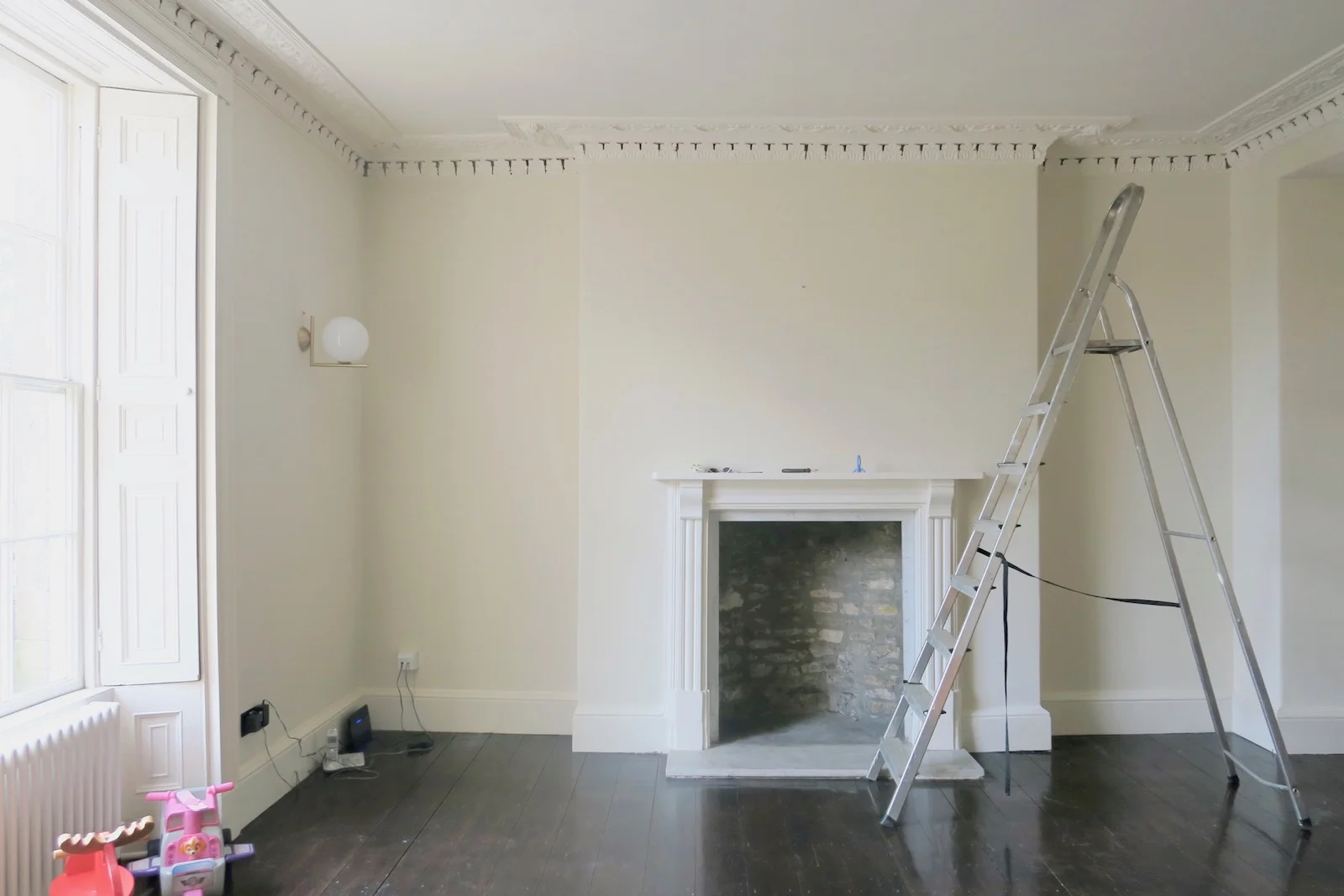
All of this house-styling stuff, this current obsession with Instagram-perfect interiors, it’s driving me to distraction! I’m just so torn. On the one hand, I want to put some effort into doing up my house – I want to make it lovely and I want to do it justice. It’s rather handsome and grand and – quite honestly – our battered de Sede sofa (not to be confused with a de Sade sofa, which I’m not sure even exists but would be something very, very different) doesn’t quite cut the mustard. (I thought that it would look cool – an iconic mid-century piece juxtaposed with classic regency styling – but it just looks old and knackered.) The walls, of which there are many, are all painted in varying shades of white and very pale grey, which is fresh – and possibly handy in providing something of a blank canvas – but lacking personality.
But where do I start? There are so many options, so many different ways to arrange and frame and layer. And I’ve been scared to get going, if truth be known, because I feel a little bit overwhelmed by it all – both the scale of the project and the vast amount of choice that we now have when it comes to wallpaper patterns, paint colours, carpet weaves, sofa sizes, curtain fabrics, curtain tracks, lightbulb wattages, rug edgings, tap finishes, window catches… It’s a bloody minefield.
So on the one hand yes, I want to do the house justice and “get it right”, but on the other hand I have Mr AMR who is (I think) entirely sick of the whole thing and would just like some carpet down and some wall lights up and a bedside table to rest his radio on thank you very much indeed. And who is of the school of thought (probably quite rightly) that a house is for living in and that it should be comfortable and practical and warm. However, he also happens to be very opinionated about interior decorating, which makes him far less laid back about the whole thing than he might initially seem. He loves good furniture and wallpaper, hates painted walls and MDF and has an obsession with “inside outside spaces” (think huge, floor-to-ceiling glazing, a la our old house).
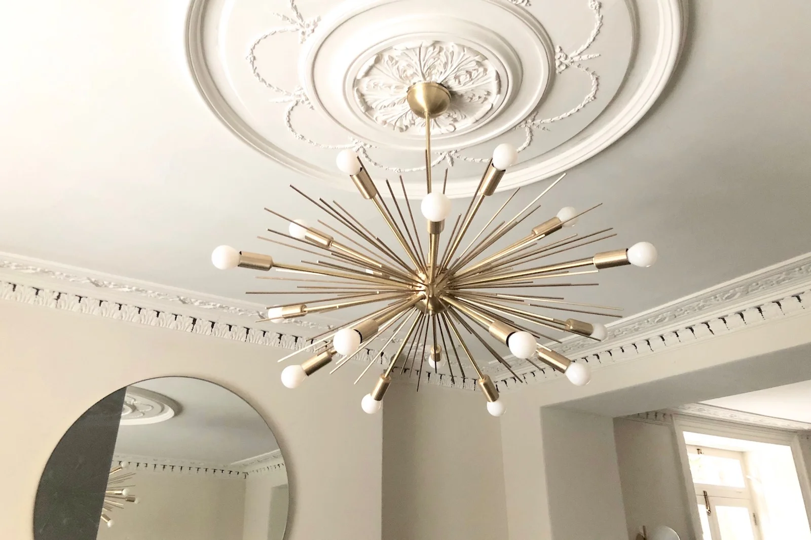
It’s clear, then, that things aren’t as straightforward as they could be with this whole house-decorating lark. An abundance of choice when it comes to decor materials, which is often not a helpful thing, an indecisive, often-in-disagreement couple (though we both adore the light we had made for the living room, pictured above) and a work life spent mostly on social media, where the interiors style du jour is “white wall + succulent + some kind of typography”. Which isn’t a diss, by any means – it’s a lovely, unfussy look – it just makes things more difficult when there’s an avalanche of imagery that’s all quite similar. You start to wonder whether your own tastes are misguided or too eccentric or just plain wrong.
But last week my style doubts were dispelled and my interiors passions reignited thanks to two people. The first, Kate Watson-Smyth, has a book (and award-winning blog) called Mad About the House and I cannot recommend it enough. I’ll write a lengthier post about it, but it basically does away with the dubious Pinterest interiors “guidance” and tells it like it is, which is that you should be decorating your home for you and your needs but also choosing things that make your heart sing. Not just beige because it’s practical. One of the things I love about the book is that it has very little in the way of pictures, which is good, because it doesn’t cloud your thoughts with fluff and forces you to think about your own spaces and how you want to use them, rather than being led by images of other people’s houses. It’s filled with practical – brilliantly useful – advice and so, if you don’t know where to start with your home, whether it’s the dark hallway you want to revive or a whole house overhaul, this is the book for you. I bought mine on Amazon here*.
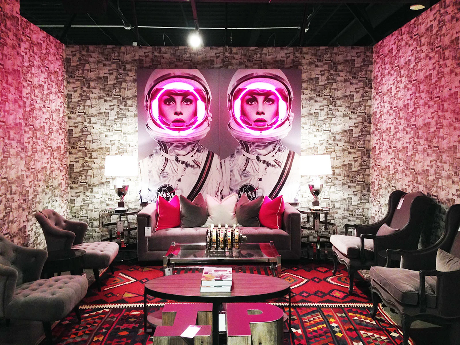
The second person to reignite my interiors spark was the wonderful Martin Waller, who founded the iconic interiors brand Andrew Martin in the 70s. The flagship Andrew Martin showroom is on Walton Street in London and I went there with Angelica on a very rainy Monday morning to take a look around. I had seen some rather splendid furniture for the living room on their website and wanted to see it “in real life” and I was so glad that I made the trip because it turned out to be an absolute treasure trove of beautiful, eclectic, sometimes-bizarre finds. Andrew Martin has quite the heritage when it comes to designing and building sets for films and making amazing, theatrical props. They do large-scale installations for shows (I saw photos of gargantuan wooden elephants, replica life-size space rockets, salvaged propellor planes) and often do the interiors for big, glitzy hotels and houses and this experience and interiors joie de vivre absolutely reveals itself in all of the things that are displayed in the showroom.
I was in my element. Quirky, unusual, slightly off-beat objects are my interiors catnip. Which is why I went away quite a lot lighter in the purse department after having bought an oversized Jeff Koons-inspired balloon dog statue. Haven’t got the foggiest where I’ll put it, but it has arrived in Somerset and is currently crated up in a mass of bubble wrap in a corner of the living room. Which will make for an interesting conversation when Mr AMR gets home… Ironically, I didn’t even get around to ordering any furniture because I didn’t want to choose it on my own – there were so many things that would have been perfect. So we’re going for a second trip, this time perhaps without Angelica, who spent an hour dancing over the top of a light installation that’s set into the floor at the entrance, and with Mr AMR.
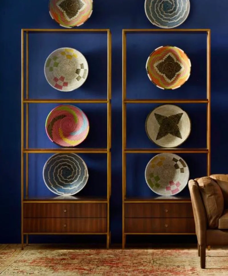
The furniture range that I have my eye on is the “Rufus” range – the brass on these shelves goes perfectly with the brushed brass lights I have in the living room and the wood is walnut, which seems to be our familial wood of choice. Along with rosewood. Can’t seem to shift those mid century leanings! This sort of thing is my ideal style – a bit of low-key glitz from the satin-finish brass, a touch of warmth from the wood and those clean, elegant lines. There’s also a console table and a coffee table, I love them all.
Lots to feast your eyes on if you go to the Andrew Martin website, but I would absolutely say to drop in at the showroom if you’re in London – I left feeling very invigorated and inspired but also comforted by the fact that there are other people who like giant apples and OTT lighting and wallpaper with flocked penguins on it. Although what I did love about the place was that the more fantastical things were sort of anchored, or tempered, by the beautifully-made, timeless pieces of furniture. There was something for everyone. I’ll take better photos the next time I go!
More interiors stuff coming up – I’ve had lots of requests for a post on lighting, so I’ll round up my current favourites for you to peruse. Also I have a sofa positioning dilemma that I need you to help solve – I realise it’s not up there with the worst of the world’s problems, but if you like floorplans and mathematical quandaries then you might find it enjoyable.




0 Comments